Visual Design & Color Systems
Color in your portfolio should serve narrative function, not decoration. Color can distinguish between project phases, highlight key diagrams, differentiate between typologies, or establish visual coherence across multiple projects. Every color choice should have a reason.
Common Color Strategies
Architectural portfolios tend to work within three broad palette families:
- Nature-Grounded Palettes: Earthy tones like terracotta, sage green, sand, and warm gray. These feel grounded and pair well with projects emphasizing sustainability, landscape, or material culture.
- Muted Contemporary Tones: Soft, restrained shades (pale cyan, muted lavender, warm coral) that feel current without being trendy. These work well for digital portfolios and suggest a forward-looking sensibility.
- Industrial Neutrals: Deep grays, charcoals, and warm blacks providing a neutral backdrop for architectural renders and photographs. Lets the work itself occupy the visual foreground.
Color Application Strategies
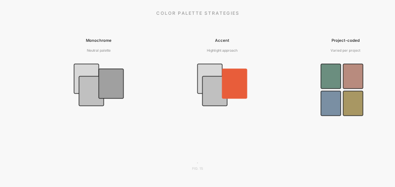
Monochromatic Approach: Use a single base color in varying tints and shades for backgrounds, borders, and highlights. Creates visual unity and reduces visual noise.
Complementary Accent System: A neutral primary palette (black, white, gray) with one accent color for emphasis (gold, teal, rust). The accent color draws attention to critical diagrams or key images.
Analogous Harmony: Three adjacent colors on the color wheel (e.g., green, teal, blue) create visual richness without clashing. Works well for projects with multiple phases or typologies.
PRO TIP: If color is not serving a functional purpose in your portfolio, remove it. A portfolio dominated by bold color can feel chaotic. A portfolio with strategic, purposeful color feels sophisticated and intentional. When in doubt, default to grayscale with a single accent color.
Accessibility and Contrast
Ensure sufficient contrast between text and background for readability. Avoid color combinations that are difficult for colorblind viewers to distinguish (red-green, blue-yellow). Use online contrast checkers to verify that your typography meets WCAG accessibility standards.