Typography as Architectural Voice
Typography in your portfolio is not decoration. It is a structural system that organizes information, establishes hierarchy, and communicates your design values. Font choice, size relationships, spacing, and alignment collectively constitute a visual language that either reinforces or undermines your credibility as a designer.
Font Selection and Psychological Impact
| Font Type | Best For | Psychological Impact |
|---|---|---|
| Sans-Serif (Helvetica, Roboto, Arial) | Digital screens, titles, short captions, contemporary work | Modern, clean, technologically savvy, accessible |
| Serif (Garamond, Times, Minion) | Lengthy body text, reflective essays, traditional work | Traditional, authoritative, intellectual, formal |
| Monospaced (Courier, Monaco, Inconsolata) | Technical notes, code-based design, data visualization | Utilitarian, precise, industrial, computational |
Typographic Hierarchy Principles
- Limit to 2–3 complementary fonts: One for titles, one for body text, optionally one for captions or special emphasis
- Establish clear size relationships: Large bold titles (often 24–36 pt), medium subheadings (18–24 pt), smaller body text (10–12 pt)
- Use weight and style strategically: Bold for emphasis, italics for quotes or defined terms, regular weight for body text
- Align text consistently: Left-aligned body text is most readable; centered text for titles; justified text rarely improves legibility
PRO TIP: Your portfolio's typography should reflect your design sensibility. If you are designing a sustainable restoration project, your typography might emphasize traditional proportions and classical serif faces. If you are showcasing computational design work, contemporary sans-serif fonts with tight tracking may better align with the work's visual character.
Typefaces for the Architecture Portfolio
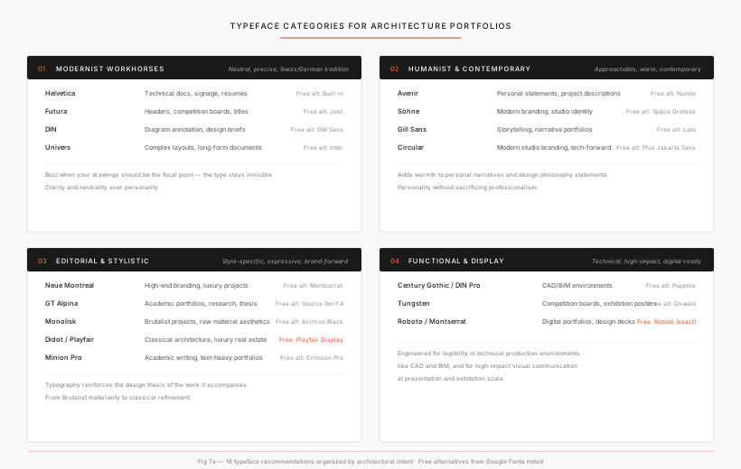
Selecting typefaces that communicate precision, materiality, and architectural intent. The 16 typefaces below are organized into four categories, from foundational modernist standards to contemporary humanist voices, editorial serifs, and technical display faces. Each commercial font is paired with a free open-source alternative from Google Fonts.
Selection Principles
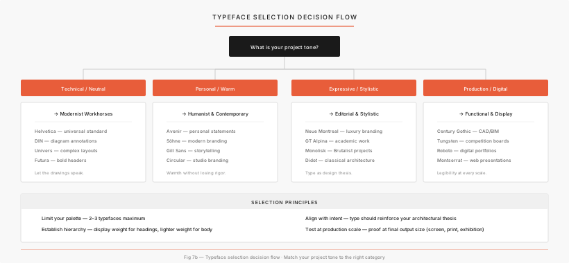
Choosing the right typeface is a design decision that communicates the same values of precision and intentionality that define the architectural work itself. Start with the tone of your project, then narrow by practical constraints.
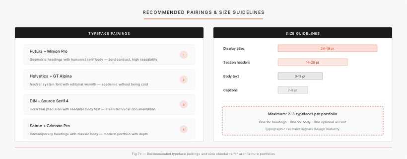
Restrict your portfolio to 2–3 typefaces maximum. Typographic restraint signals design maturity. One for titles, one for body text, and optionally one for captions or special emphasis.
Pair a display weight for headings with a lighter weight for body text to create clear visual order. Large bold titles (24–48 pt), medium subheadings (14–20 pt), body text (9–11 pt), and captions (7–8 pt).
Your typeface should reinforce the architectural thesis and tectonic language of the work shown. A sustainable restoration project calls for classical serif proportions; computational design work pairs with tight-tracked sans-serifs.
Always proof your typeface choices at the final output size: screen, print, or exhibition. What reads well at 100% on screen may fall apart at A1 print scale or look oversized on a phone.
01. The Modernist Workhorses
Neutral and precise, rooted in the Swiss International Style and German engineering traditions, these typefaces prioritize clarity and neutrality, ensuring that complex architectural drawings and diagrams remain the focal point of the page.
| Typeface | Best For | Character | Free Alternative |
|---|---|---|---|
| Helvetica | Technical documentation, signage, resumes | The universal standard. Neo-grotesque neutrality that never competes with drawings | Built-in (system font) |
| Futura | Headers, competition boards, titles | Bauhaus "form follows function". Geometric, based on circles, triangles, and lines | Jost |
| DIN | Annotating diagrams, design briefs | German industrial engineering. Highly exact, systematic precision | DM Sans |
| Univers | Complex layouts, long-form documents | Systematic family structure. Exceptional flexibility across weights and widths | Inter |
02. Humanist & Contemporary
Approachable and warm. As contemporary practice moves beyond purely rationalist aesthetics, humanist typefaces introduce a calibrated warmth to personal narratives, design philosophy statements, and digital portfolios.
| Typeface | Best For | Character | Free Alternative |
|---|---|---|---|
| Avenir | Personal statements, project descriptions | Geometric style blended with humanistic proportions. Fresh and approachable | Nunito |
| Söhne | Modern branding, studio identity | Klim Type Foundry. Analog subway signage feel with a contemporary edge | Space Grotesk |
| Gill Sans | Storytelling, narrative-driven portfolios | Classic British typography. Geometric simplicity with warmth and elegance | Lato |
| Circular | Modern studio branding, tech-forward projects | Geometric sans-serif adopted by Spotify and Airbnb. Precise and friendly | Plus Jakarta Sans |
03. Editorial & Stylistic
For specific architectural styles. Typography should reinforce the design thesis of the work it accompanies. These typefaces let you align typographic expression with architectural intent, from Brutalist materiality to classical refinement.
| Typeface | Best For | Character | Free Alternative |
|---|---|---|---|
| Neue Montreal | High-end branding, luxury projects | Pangram Pangram. High-end, luxury editorial feel, refined and contemporary | Montserrat |
| GT Alpina | Academic portfolios, research, thesis | A "workhorse serif" balancing utility with personality. Academic undertone | Source Serif 4 |
| Monolisk | Brutalist projects, raw material aesthetics | Sturdy, angular font that echoes raw concrete forms of Brutalism | Archivo Black |
| Didot / Playfair Display | Classical architecture, luxury real estate | High-contrast serifs providing elegant authority. Refinement is critical | Playfair Display (free, exact match) |
| Minion Pro | Academic writing, text-heavy portfolios | Adobe classic. One of the most refined humanist oldstyle serifs available | Crimson Pro |
04. Functional & Display
For drafting and presentations. Engineered for legibility in technical production environments such as CAD and BIM, and for high-impact visual communication at presentation and exhibition scale.
| Typeface | Best For | Character | Free Alternative |
|---|---|---|---|
| Century Gothic / DIN Pro | CAD/BIM environments, technical drawings | Highly legible in screen-based layouts. Replaces system fonts like Arial | Poppins |
| Tungsten | Competition boards, exhibition posters | Vertically compressed with high-impact energy. Commands attention at scale | Oswald |
| Roboto / Montserrat | Digital portfolios, design decks, resumes | Open, friendly geometry for digital fluency. Works well on screen | Roboto (free, exact match) |
Recommended Pairings & Size Standards
Pairing typefaces is about creating contrast without conflict. A geometric sans-serif heading paired with a humanist serif body creates visual tension that draws readers through the page. Below are four tested combinations and the size relationships that keep them in proportion.
Font Sources & Licensing
Several typefaces in this guide are commercially licensed. However, three are available at no additional cost through Adobe Creative Cloud, which most architecture programs provide to students. Every commercial font is also paired with a high-quality open-source alternative for those without commercial access.
Minion Pro → Minion 3 / Minion Pro (full family)
Futura → Futura PT, Paratype version (full family)
Helvetica → Helvetica Now (added to Adobe Fonts in 2025)
Activate these at fonts.adobe.com with no extra cost with any CC plan. Adobe offers 40–60% student discounts on Creative Cloud subscriptions.
Many foundries offer educational discounts of 50–90%. Contact them with your .edu email address. Some universities also have institutional font licenses. Check with your IT department.
All free alternatives in this guide are from Google Fonts and can be used freely in academic and professional work without licensing restrictions.
A FINAL NOTE: Typography is as integral to your design language as the drawings themselves. Select no more than two or three typefaces that reinforce the conceptual framework of your work, and apply them with the same rigor you bring to architectural detailing. The best typography is invisible. It structures the viewer's experience without competing with the work it presents.