Grid Systems & Layout
A grid is a system of invisible lines that organizes content on a page. It determines where text sits, where images align, and how white space is distributed. Without a grid, a portfolio is a collection of pages. With one, it becomes a coherent document. The grid is the invisible architecture of your portfolio. It should feel inevitable, not restrictive.
Why the Grid Matters
Grids exist to solve a fundamental problem: how do you arrange complex information (text, images, diagrams, captions) so that it feels intentional rather than accidental? A strong grid provides three things: consistency across pages so reviewers can focus on content rather than navigation, hierarchy so the eye knows where to go first, and rhythm so the portfolio feels composed rather than assembled.
KEY INSIGHT: A portfolio without a grid is like a building without a structural system. You might get away with it for a page or two, but the moment complexity increases. Multiple images, captions, diagrams. Everything collapses. The grid is what holds the portfolio together.
Grid Anatomy
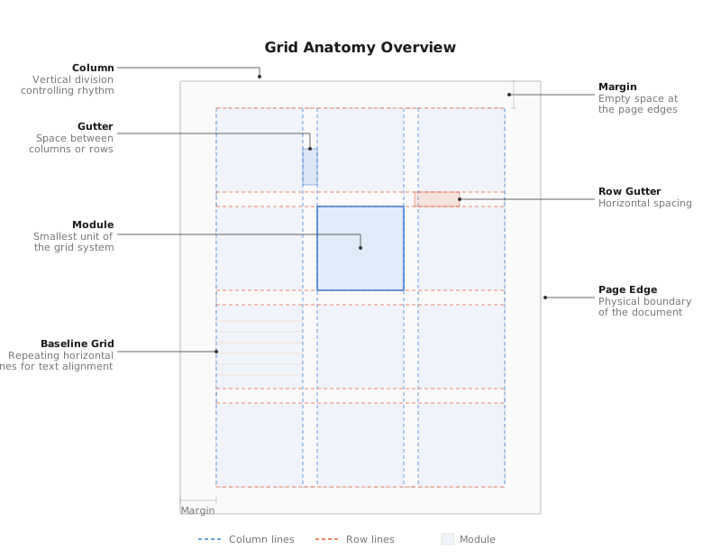
Before building a grid, you need to understand its components. Every grid is made up of columns, gutters, modules, margins, and baseline increments. These parts work together the same way structural elements work together in a building. Each one has a role, and removing any one of them compromises the whole system.
A Brief History
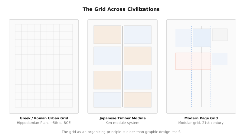
The grid is not a modern invention. The Greek and Roman Hippodamian plan organized cities into orthogonal blocks. The Japanese Ken module governed timber construction proportions for centuries. The typographic grid emerged in post-war Switzerland through Josef Muller-Brockmann and the Swiss International Style, a response to chaos, an attempt to bring order, clarity, and objectivity to visual communication. The same impulse that drives you to align columns in a floor plan should drive how you organize a portfolio spread.
The Design Analogy: Structure = Layout
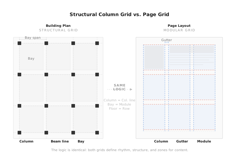
Think of your portfolio page the way you think about a building. A building has a structural column grid: vertical elements that carry loads and define spatial rhythm. A page has a column grid: vertical divisions that carry content and define visual rhythm. Columns determine where walls and openings go; on the page, columns determine where images and text go. Beams span between columns to create floor plates; baselines span across the page to create consistent text alignment. The margin is your setback: the distance between the edge and the usable space.
The Ideal System: Baseline + Modular
A professional portfolio grid combines two systems working together. The baseline grid controls horizontal rhythm. It ensures every line of text, every caption, and every image edge aligns to the same invisible horizontal lines. The modular grid controls vertical structure. It divides the page into columns and modules that determine content width and placement.
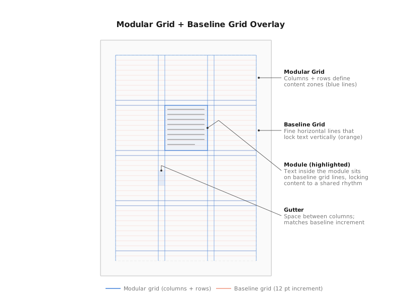
When these two systems overlap, you get a complete framework: a matrix of cells where every element on the page has a precise location. Text snaps to baselines. Images span exact column widths. Captions align with image edges. White space becomes intentional rather than accidental.
PRO TIP: For most architecture and landscape architecture portfolios, a modular grid (baseline + columns) is the ideal system. It gives you the precision to handle plan drawings, section cuts, renderings, detail photos, and text blocks, all on the same page. Without visual conflict.
The Atomic Unit: Why 12pt
Every grid needs a base unit: the smallest increment from which all other measurements derive. In architecture, this might be a 4-inch module or a 600mm planning grid. In portfolio design, the atomic unit is 12 points.
Why 12? Because 12 is the most divisible small number. It divides evenly by 2, 3, 4, and 6, giving you maximum flexibility for spacing, margins, gutters, and type sizes. Your body text at 9pt sits cleanly on a 12pt baseline. Your heading at 24pt spans exactly 2 baseline increments. Your margins at 48pt equal exactly 4 increments. Everything relates back to 12.
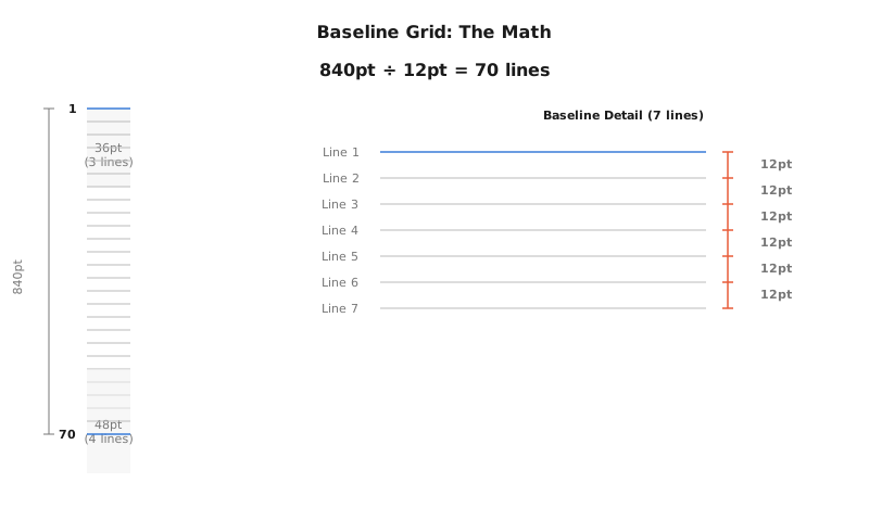
KEY INSIGHT: The 12pt unit is to your portfolio what the structural bay is to a building. Every dimension, column width, gutter, margin, leading, should be a multiple of 12. This creates mathematical harmony across every page, the same way a consistent structural bay creates spatial harmony across every floor plate.
Module Anatomy
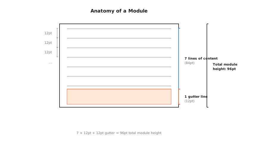
A module is the basic building block of your modular grid. One column wide by a set number of baselines tall. Understanding how modules are constructed from baseline increments is essential. Each module contains a content zone (where text and images sit) and a gutter zone (the space between modules). In a 12pt system, a module might be 7 content lines (84pt) plus 1 gutter line (12pt), giving a total module height of 96pt.
Phase 1: Preparing the InDesign Workspace
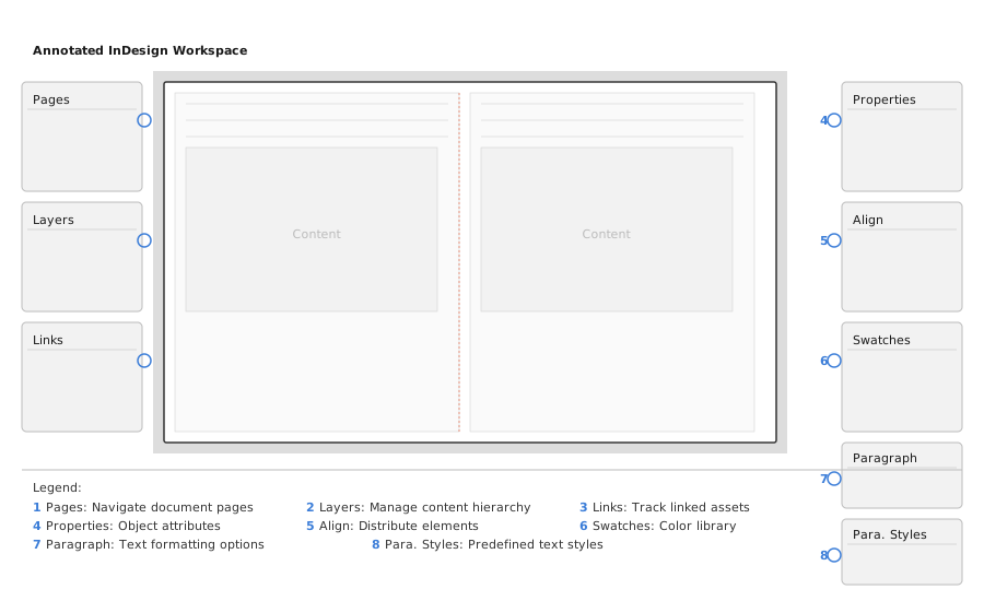
Before constructing your grid, set up your InDesign workspace correctly. Your workspace should include the Pages panel, Layers panel, and Links panel on the left; the central canvas showing your two-page spread; and the Properties, Align, Swatches, Paragraph, and Paragraph Styles panels on the right.
Go to Preferences > Units & Increments and change both Horizontal and Vertical rulers from inches to points. This is critical. Working in points gives you the precision needed for grid construction. Set your Keyboard Increment to 12pt so nudging objects with arrow keys moves them exactly one grid unit.
Phase 2: Constructing the Page
Create a new document with these specifications for a standard portfolio page:
| Parameter | Value | Rationale |
|---|---|---|
| Page Size | 600 x 840 pt (8.33 x 11.67 in) | Clean proportion, slightly taller than letter |
| Top Margin | 36 pt | 3 baseline increments |
| Bottom Margin | 48 pt | 4 baseline increments |
| Inside Margin | 36 pt | 3 increments |
| Outside Margin | 36 pt | 3 baseline increments |
| Columns | 6 | Maximum flexibility (spans of 1, 2, 3, or 6) |
| Gutter | 12 pt | 1 baseline increment |
| Baseline Grid | 12 pt increment | The atomic unit |
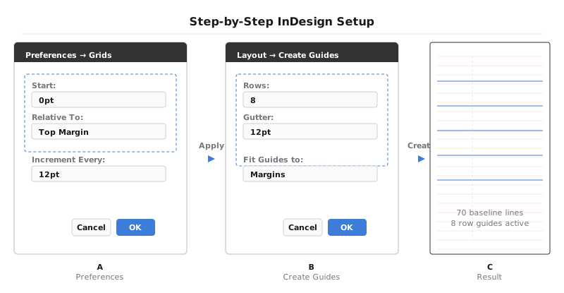
Under Preferences > Grids, set the Baseline Grid start to 0pt, relative to Top of Page, and the increment to 12pt. Then use Layout > Create Guides to add 8 row guides with 12pt gutters. The result is a page with 70 baseline lines and 8 horizontal row divisions. Your complete modular framework.
Six columns is the recommended starting point because 6 divides into flexible arrangements: a full-width image spans all 6 columns, a large image takes 4 with text in the remaining 2, two equal images each take 3, or three equal columns of 2 each. This single column count handles virtually every layout scenario you will encounter.
Phase 3: Applying the Grid
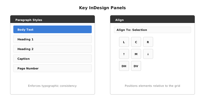
With your grid constructed, every element on the page must respect it. Set all text frames to Align to Baseline Grid in the paragraph settings. This ensures every line of body text, every caption, and every heading locks to the 12pt baseline. Images should snap to column edges. Their widths should span exact column multiples, and their top and bottom edges should align to baseline increments.
When placing content, think in modules. A module is one column wide by a set number of baselines tall. An image might occupy a 3-column x 20-baseline module. A text block might fill a 2-column x 15-baseline module. Every element has a precise address on the grid.
Consistency Across Spreads
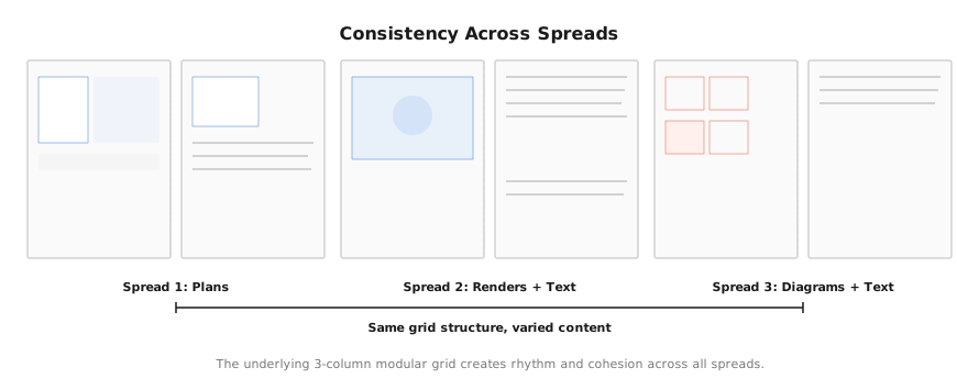
The true power of a grid reveals itself across multiple pages. When the same 3-column modular grid underlies every spread, whether showing plans, renders with text, or diagrams, the portfolio develops visual rhythm and cohesion. Reviewers can navigate intuitively because the underlying structure is familiar, even as the content changes.
Common Mistake: Baseline Drift
Baseline drift occurs when text gradually falls off the grid, usually because a heading, image, or spacing value introduced a non-12pt increment. Once one element drifts, everything below it misaligns. The result is subtle but noticeable: text across columns no longer lines up horizontally, captions float at slightly different heights, and the page loses its sense of precision.
COMMON MISTAKE: Inserting a 15pt space after a heading or using a non-grid image height. This pushes all subsequent text off the baseline grid. Always use spacing values that are multiples of 12pt: 12, 24, 36, 48. If an image height does not land on a baseline, adjust it until it does. Precision here is non-negotiable.
White Space as Design Strategy
White space is perhaps the most undervalued tool in portfolio design. It provides visual relief, prevents cognitive overload, and directs focus. A crowded page signals a lack of confidence; a balanced layout embracing empty space suggests a designer in control of the narrative. Empty modules in your grid are not wasted space. They are compositional decisions. Learn to see white space as an active element, not a passive one.
Layout and Visual Hierarchy
Use your grid to establish a reading pattern. The F-pattern (viewers scan left-to-right, then down the left side) and Z-pattern (diagonal scanning) are natural eye movements. Position your most important content: the hero image, the project title, the key diagram. Along these visual pathways. Secondary content (process images, captions, supplementary drawings) fills the supporting grid positions.
KEY INSIGHT: A consistent grid applied across all portfolio pages creates coherence and professionalism. When a viewer moves from one project to the next, the familiar grid structure allows them to focus on content rather than navigating new layouts. Consistency is a form of confidence. The grid is not where creativity goes to die. It is where clarity begins.